
A good-looking email does one job: it puts one strong idea across in a layout people can read at a glance, and its call to action is obvious. The three 2009 campaigns below still show how that works. They also show what has changed since then. Mostly-image emails like these now have to survive dark mode, small phone screens, screen readers and Gmail’s image proxy. Since 2024, the Gmail and Yahoo bulk sender rules on SPF, DKIM, DMARC, one-click unsubscribe and spam rates decide whether a design reaches the inbox at all.
Some of these emails ignore design best practice, because they are built mostly from images. They still left a lasting impression, and each one has something worth borrowing.
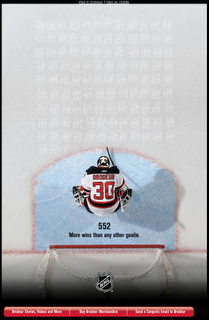
The NHL’s Martin Brodeur email
The strongest design of the three came from the NHL in March 2009. It celebrated Martin Brodeur becoming the winningest goalie in NHL history. Brodeur tied Patrick Roy’s record of 551 wins on March 14, 2009, then passed it with his 552nd win, a 3-2 New Jersey Devils victory over the Chicago Blackhawks at the Prudential Center on March 17, 2009. He went on to finish his career with 691 regular-season wins.
The email’s “chk” marks were a subtle and effective way to show all of those wins. Near the footer, three buttons all centred on Brodeur: one for his career history, one for merchandise, and one that let fans send him their own congratulations email. That is a single theme carried from the headline down to every call to action.

Apple’s iPod shuffle email
Apple has always been a design-led company, and that ran from its products through its marketing to its emails. By 2009 its influence on the design world, especially since the early 2000s, was hard to miss. Critics even saw it on the bridge of the new USS Enterprise in J.J. Abrams’ 2009 Star Trek film.

Apple sent the email below when it launched the third-generation iPod shuffle on March 11, 2009. The tiny $79 player held 4GB, had no screen, and used a VoiceOver feature that read out song titles, artists and playlist names. The email got the balance of images and text right. It sold that talking feature with the “small talk” tagline and gave a guided tour of a player small enough to need one. Apple discontinued the iPod shuffle in 2017, but the email is still a model of a product launch done well.

MacHeist’s Apple-inspired email
The MacHeist email shows how far Apple’s look had spread in 2009. MacHeist sold discounted bundles of Mac software (its 2009 MacHeist 3 bundle cost $39 and raised money for charity), and its email had a louder, more playful feel than anything Apple sent. It still stayed close to Apple’s look and feel.
Like the Brodeur email, it was made mostly of images. A sales email that is roughly 80 percent images was a risky strategy then, and it is riskier now. Still, it looked good, and it proves that a consistent visual identity can carry a lot of a message.

What these designs teach in 2026
The design lessons still hold: one theme, a clear hierarchy and calls to action that match the story. How these emails were built is the part that has aged.
| Then (2009) | Now (November 2026) |
|---|---|
| Image-heavy layouts were common, and Outlook 2007’s Word-based rendering pushed designers toward sliced images | Live HTML text with descriptive alt text reads better on mobile, with screen readers, and when images are blocked |
| Designs were checked on a white background | Dark mode in Apple Mail, Gmail and Outlook can invert colours, so logos need transparent PNGs and explicit background colours |
| Opens were a fair way to judge a design | Apple Mail Privacy Protection (since iOS 15 in 2021) and Gmail’s image proxy (since 2013) make opens unreliable, so clicks matter more |
| Inbox placement depended mainly on content filters | Gmail and Yahoo have required SPF, DKIM, DMARC, one-click unsubscribe and a spam rate below 0.3% for bulk senders since February 2024 |
| Few providers had volume-based sender rules | Microsoft has applied similar rules since May 5, 2025 to domains sending more than 5,000 messages a day to Outlook.com, Hotmail.com and Live.com |
If you want the visual impact of the Brodeur or MacHeist emails, use a hero image for the mood. Then put the headline, the key copy and the buttons in live HTML. The email still looks right when images are off, and Gmail can show your text in the preview.
FAQ
Are image-only emails bad for deliverability?
They are a risk, though not an automatic ban. Filters can’t read much from a single large image, readers with images turned off see an empty box, and screen readers have nothing to announce. Mixing live text with images, and writing descriptive alt text, protects both inbox placement and readability.
What is a good image-to-text balance for a marketing email?
No mailbox provider publishes a required ratio. What works is a layout where the main message, the offer and the call to action are all live text, with images supporting them. Apple’s iPod shuffle email is a good model: it worked because it didn’t depend on the images alone.
How do you make a designed email work in dark mode?
Use transparent PNGs for logos and icons, so they don’t sit inside white boxes. Set background colours explicitly instead of assuming white. Test in Apple Mail, the Gmail app and Outlook in both light and dark mode before you send. Text baked into images won’t adapt to dark mode, which is another reason to keep headlines in HTML.
Why does Gmail clip some designed emails?
Gmail clips messages whose HTML is larger than about 102KB and shows a “View entire message” link. Clipping can hide your footer and unsubscribe link. Image files hosted elsewhere don’t count toward that limit, but bloated code from drag-and-drop builders does, so clean up the HTML before you send.
Can open rates tell you whether a new design is working?
Not on their own any more. Apple Mail Privacy Protection preloads images, which inflates opens for Apple Mail users. Clicks, conversions and revenue per email are better signals when you compare two designs.
Does a promotional design email need an unsubscribe header?
Yes. Bulk senders to Gmail and Yahoo need a one-click List-Unsubscribe header (RFC 8058) on marketing mail, as well as a visible unsubscribe link in the body, and must honour requests within two days. The FTC’s CAN-SPAM rules also require a working opt-out and a valid physical postal address in every commercial email.
Sources
- Google: Email sender guidelines
- Google: Email sender guidelines FAQ
- Yahoo Sender Hub: Sender best practices
- Microsoft Tech Community: Outlook’s new requirements for high-volume senders
- FTC: CAN-SPAM Act compliance guide for business
- Apple Newsroom: Apple announces new iPod shuffle (March 11, 2009)
- NHL.com: Martin Brodeur remembers passing Patrick Roy as all-time leader