
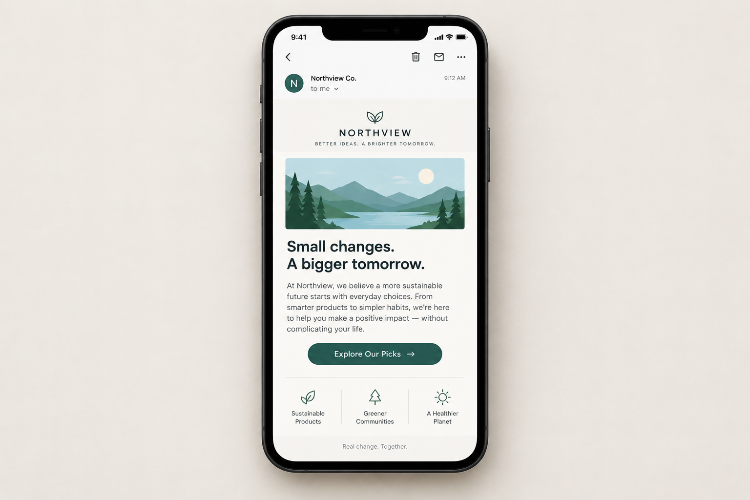
Most of your subscribers now read email on a phone, so design for a one-thumb, small-screen reader first: one column, body text of 14 to 16px, tap targets of at least 44 by 44 points, and big HTML buttons in place of small text links. The basics in this guide still apply, but one thing has changed since it was written. Apple Mail Privacy Protection now inflates open rates, so open data can’t reliably tell you when or where people read. Gmail and Yahoo’s 2024 bulk sender rules (SPF, DKIM, DMARC, one-click unsubscribe and a spam rate under 0.3%) also mean a good-looking mobile email still has to pass authentication before anyone sees it, and dark mode now affects how every design renders.
Style Campaign built its reputation on niche email design topics such as video, animated GIFs and, at the time this post was written, mobile.
Back then, mobile was at the top of every email marketer’s mind. The question was not whether mobile would take over the majority of email client market share but when. That shift has happened. Litmus’s email client market share data for February 2026 put Apple at about 45.5% of tracked opens and Gmail at about 23.5%, with Outlook desktop under 6%. A large share of those Apple opens come from iPhones. Mail Privacy Protection inflates the Apple figure, though, because Apple preloads images and fires tracking pixels whether or not the person reads the email.
So email designs have to work on mobile devices. This article at Style Campaign covered the dos and don’ts of mobile email design in detail. It was a useful read for anyone redesigning a newsletter for mobile, and the main points are summarised below with notes on what still holds today.
Key takeaways from the original guide
Five of the six original tips still hold, with updated numbers. The one that has aged worst is the precise “7 AM peak”. The table gives the short version, and each point is covered in more detail below.
| Original tip | Status today | What to do now |
|---|---|---|
| Mobile email use peaks around 7 AM | Dated; timing varies by audience | Design for distracted readers; test send times against clicks |
| 44×44 tap targets | Still Apple’s minimum | 44×44 points minimum, 48×48 dp on Android |
| Big buttons beat tiny ones | Still true | Full-width HTML buttons on mobile |
| Most people use their right hand | Partly true, phones are bigger now | Put the main call to action in the centre of the screen |
| Text under 12px scales up | Threshold is 13px in iOS Mail | Use 14 to 16px body text; control scaling with CSS |
| Mobile navigation can differ from the site | Still true | Simplify or hide navigation on small screens |
Mobile email use once peaked around 7 AM
The original guide said mobile email use peaked around 7 AM, when people were just waking up. Readers at that hour are half awake and clumsy with their phones, so emails had to be easy to use for a tired, pre-coffee audience.
The design lesson still holds: assume a distracted reader with one free hand and a few seconds to spare. A single 7 AM peak is no longer a safe planning number, though. Reading habits differ by audience, industry and time zone. Since 2021, Apple Mail Privacy Protection also records “opens” when Apple preloads the email, not when a person reads it, so open timestamps for Apple Mail users are unreliable. Base send-time tests on clicks and conversions, not opens.
Use 44×44 tap targets
Apple’s Human Interface Guidelines set 44 by 44 points as the minimum tap target for a fingertip. The original guide called 44×44 the “perfect” size, but Apple treats it as a floor, not an ideal. Don’t put competing links inside that area, because one-handed readers need room to tap the right one.
Other platforms use similar numbers:
- Apple (iOS): 44 x 44 points minimum
- Google Material Design (Android): 48 x 48 dp
- WCAG 2.2: 24 x 24 CSS pixels at Level AA, and 44 x 44 at the enhanced Level AAA
In practice, a button 44 to 48 pixels tall with clear space around it works in Apple Mail, the Gmail app and Outlook mobile. If you stack text links in a footer, add enough line height or padding that each link gets its own 44-pixel row.
Big buttons beat tiny ones
Big buttons make for a better mobile experience than tiny ones. That has not changed. Today the standard approach is a “bulletproof” button: a coloured table cell or styled link with live HTML text, not an image of a button. A bulletproof button still shows and still works when images are blocked, and screen readers can read it.
A worked example: a desktop button 200 pixels wide becomes a full-width button on screens under about 480 pixels. Set it to around 48 pixels tall with 16 to 18px text. Keep one main call to action per screen, and push secondary links lower down as plain text.
Plan for how people hold their phones
The original guide said most people hold their phones in their right hand, so you should think about ergonomics when you place icons and links. The best-known research on this is Steven Hoober’s 2013 field study for UXmatters. It found that 49% of people held their phone in one hand, 36% cradled it and 15% used two hands. Among the one-handed users, 67% used their right thumb.
Phones have grown a lot since 2013, which makes the top corners harder to reach with one thumb. Rather than designing only for right-handed use, put your main button in the centre of the screen and avoid tiny tap targets near the top corners or edges.
Small text gets resized
The original advice said text under 12px scales up and can break your design. iOS Mail’s actual threshold is 13px. Any text smaller than that gets enlarged, which can push columns out of line. The old fix was this style:
-webkit-text-size-adjust: none;
The safer form today is:
body, table, td, a {
 -webkit-text-size-adjust: 100%;
 -ms-text-size-adjust: 100%;
}
Setting the value to none can stop readers from zooming in some clients, which is an accessibility problem. Some clients, including Gmail on the web, also strip these styles. The more reliable fix is to avoid tiny text in the first place: use 14 to 16px for body copy, 22px or more for headlines, and no less than 12 to 13px even for legal footer text.
Mobile navigation doesn’t have to copy the website
Matching your email’s navigation to your website’s navigation is good practice on desktop, but you don’t have to do the same on mobile. A row of six menu links becomes a row of tiny, crowded tap targets on a phone. Most mobile layouts either hide the navigation with a media query, cut it to two or three key links, or move it to the footer as stacked, full-width rows.
What has changed in mobile email since this was written
Mobile-first is now the default way to design email, so the question this post ended on has been answered. Mobile did shape every email design that came after. Several later changes matter as much as screen size, and some old tactics are now history.
Dark mode
Apple Mail, the Gmail app and Outlook all offer dark mode, and each client inverts or adjusts colours differently. Use logos with transparent backgrounds and a light outline or glow, avoid text built into images, and preview your design in both light and dark themes before you send.
Gmail clipping
Gmail cuts off messages whose HTML is larger than about 102KB and shows a “View entire message” link. Images hosted elsewhere don’t count toward that limit, but inline CSS and long tracking URLs do. Clipping can also hide your unsubscribe link and your open-tracking pixel, so keep your code lean.
Sender rules that apply to every design
From February 2024, Gmail and Yahoo require bulk senders (about 5,000 or more messages a day to personal Gmail accounts) to:
- authenticate with SPF and DKIM
- publish a DMARC policy
- support one-click unsubscribe, which has been required since June 2024
- keep spam complaint rates below 0.3%
Google recommends aiming for a spam rate under 0.1%. In November 2025, Gmail stepped up enforcement and began rejecting mail that fails these requirements, both temporarily and permanently. Microsoft’s Outlook.com began enforcing similar rules for high-volume senders on May 5, 2025.
The minimum DMARC record looks like this:
_dmarc.example.com. TXT "v=DMARC1; p=none; rua=mailto:[email protected]"
One-click unsubscribe uses two headers:
List-Unsubscribe: <https://example.com/unsub?id=abc123>, <mailto:[email protected]>
List-Unsubscribe-Post: List-Unsubscribe=One-Click
Every commercial email also has to follow the FTC’s CAN-SPAM rules: a clear way to opt out, a valid physical postal address, and opt-out requests honoured within 10 business days.
Old tactics that are now history
Several fixes from the early days of mobile email are no longer needed. Separate “mobile versions” sent to a different list, and designing around old phones such as BlackBerry, have given way to a single responsive or fluid-hybrid template. Designing around Outlook 2007’s Word rendering engine is also fading, since Microsoft is moving users to the new Outlook for Windows. Classic Outlook still needs testing, though.
The practical next step is to open your last three campaigns on your own phone, in dark mode, with one thumb. If you can’t find and tap the main button within a few seconds, start your redesign there.
FAQ
What is the best width for a mobile-friendly email?
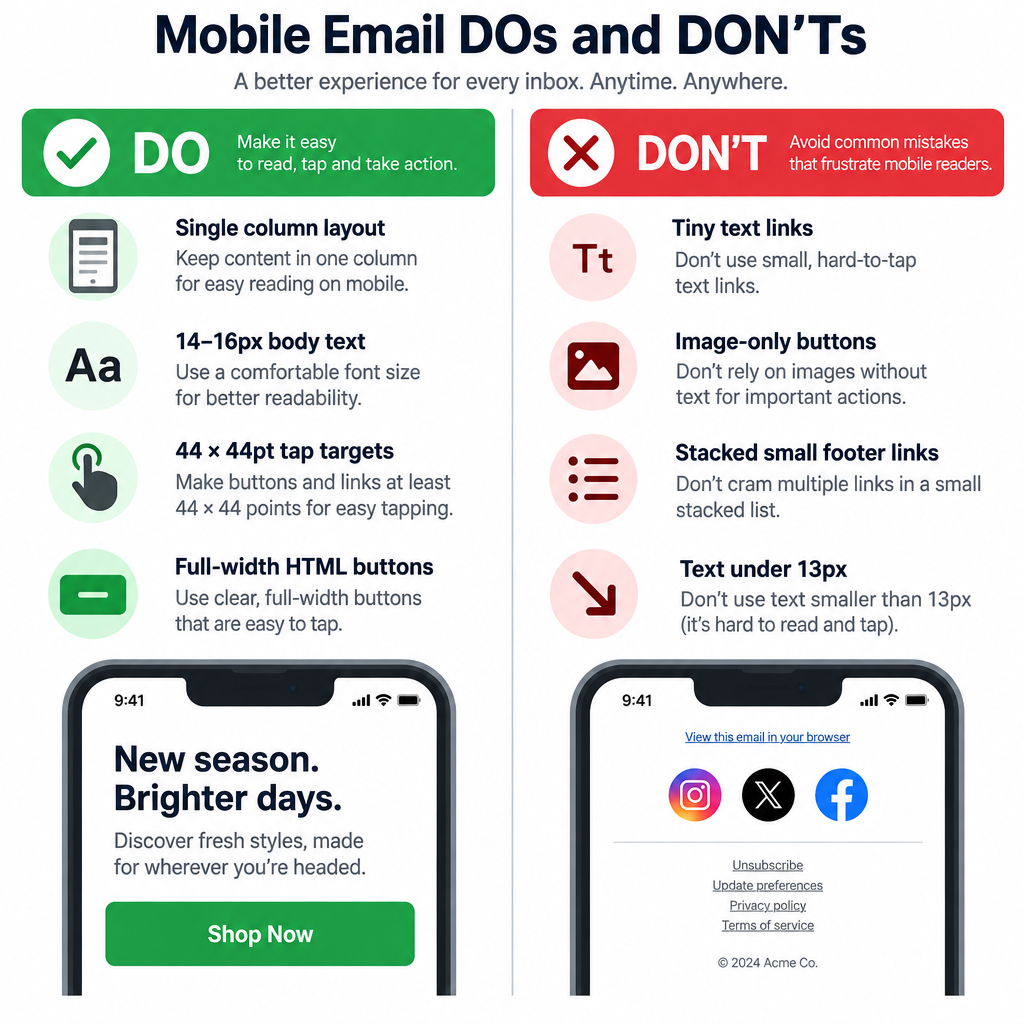
Most templates use a 600 to 640 pixel desktop width that shrinks to the full screen width on phones. Build in a single column, or use columns that stack below about 480 pixels. That way the email reads well on phones from about 320 pixels wide up to tablets.
What font size should I use in mobile emails?
Use 14 to 16px for body text and 22px or more for headlines. iOS Mail enlarges text under 13px, which can break layouts, so never set copy smaller than that. Bigger text also helps readers in dark mode and anyone who reads with their screen dimmed.
Are open rates still useful for measuring mobile campaigns?
Only as a rough signal. Apple Mail Privacy Protection preloads images, which records opens for many Apple Mail users whether or not they read the email. Clicks, conversions and replies are more reliable ways to compare designs and send times.
Do Gmail and Yahoo’s sender rules affect email design?
Yes, in practical ways. Every marketing email must include a visible unsubscribe link and support one-click unsubscribe headers. Hiding the unsubscribe link or making it hard to tap on mobile tends to push readers to the spam button, which raises your complaint rate toward the 0.3% limit.
Should I use image-based buttons in mobile emails?
No. Use HTML buttons built from styled table cells or links, so the button still shows and works when images are blocked. HTML buttons also scale cleanly, and screen readers can read their text aloud.
How do I test how my email looks on phones?
Send test emails to real devices running Apple Mail, the Gmail app and Outlook mobile, and check each one in both light and dark mode. Preview tools such as Litmus and Email on Acid show many clients at once. A quick check on a real phone with one thumb will also catch tap-target problems.
Sources
- Google, Email sender guidelines (Gmail Help)
- Yahoo Sender Hub, Sender Best Practices
- Federal Trade Commission, CAN-SPAM Act: A Compliance Guide for Business
- Apple, Human Interface Guidelines: Accessibility and hit targets
- Litmus, Email Client Market Share and Litmus Help on Gmail clipping
- Campaign Monitor, CSS support guide for iOS Mail
- UXmatters, Steven Hoober, “How Do Users Really Hold Mobile Devices?” (2013)