
 Most homeowners picture a perfectly manicured lawn, with shrubs and accent plants that leave the neighbors green with envy (no pun intended). Most lawns don’t look like that.
That gap between the dream and the real lawn is what a Scotts email played on when it invited subscribers to join the “Scotts Lawn Advisory Panel.” The subscriber in this case had opted in to Scotts emails about a year earlier. The messages were usually targeted to the subscriber’s region of the country. They arrived too rarely to build much brand loyalty, though.
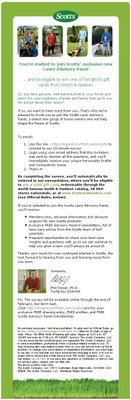
This message missed the mark on design. The subject line, “You’re specially invited to join the Scotts Lawn Advisory Panel,” was interesting enough to get the email opened.
What showed in the preview pane
The preview pane showed only the Scotts logo, four small images and the first line of text: “You’re invited to join Scotts’ exclusive new.” That was it.
A reader who didn’t scroll down would never learn the best part. Anyone who filled out the 10-minute survey had a chance to win one of ten $500 gift cards from Smith & Hawken.
The preview pane was the desktop view of its day, mostly in Outlook. Today the same problem shows up in two places: the inbox line, where the subject and preview text share one row, and the first screen of the open email on a phone. Mobile Gmail shows only about 35 to 55 characters of preview text. That makes the first words of the email, and the first screen of the design, even more important than they were when this campaign went out.
What the Scotts email did well
The email did several things right, and they’re still good practice today.
- It set expectations up front. Readers knew roughly how long the survey would take before they started.
- It linked to the partner. The Smith & Hawken link worked well. One look at the partner site was enough to change the mind of someone who hadn’t planned to take the survey.
- It explained the benefits. The email described what panel members would get if they were selected.
Smith & Hawken was the upscale garden retailer Scotts Miracle-Gro owned at the time. Scotts announced in July 2009 that it would close the business, and the stores were all shut by November 2009. The brand name was sold to Target at the end of that year, so the partner link and gift cards are now history.
According to the email, the panel benefits included:
Those are solid perks, and a real reason for anyone with a struggling lawn to apply.
What Scotts could have improved
There were a few places where Scotts could have done better.
- No links to the Scotts website. The email didn’t link to scotts.com anywhere. The obvious spot was the Scotts logo above the fold.
- Small images that didn’t link. The four images above the fold were so small they were hard to make out, and none of them were clickable. Both were missed chances to send traffic to the site.
- A buried call to action. The gift card prize, and the fact that taking the survey entered you in the sweepstakes automatically, should have been in the subject line or at least above the fold. With that offer buried deep in the message, Scotts almost certainly got fewer conversions than it would have with the offer up top.
- A messy footer. The sweepstakes rules at the bottom ran straight into the standard footer and looked like a jumbled mess. Keep the official rules in their own clearly labeled block, or link to a rules page. That way the footer still clearly shows the items the U.S. CAN-SPAM Act requires: a working opt-out and a valid physical postal address.
A campaign like this one had a lot of potential. In this case, though, the design got in the way of both website traffic and conversions.
How these fixes apply to an email sent today
The same four fixes still hold, and newer inbox rules raise the stakes.
- Write the hook into the subject and preview text. Put the prize or the main benefit in the first 35 to 55 characters, because that’s all a phone reliably shows.
- Make the logo, images and buttons tap-friendly. Use real HTML text for the offer and a large button, not tiny images. Add alt text so the email still makes sense if images don’t load or if dark mode changes the colors.
- Measure clicks, not opens. Apple Mail Privacy Protection preloads images, tracking pixels included, so opens are inflated. Litmus’s client market share reports put Apple’s privacy-affected opens at more than half of all tracked opens. Click-through rate and survey completions tell you far more about whether a design works.
- Keep the email under about 102KB of HTML. Gmail clips longer messages behind a “View entire message” link. That can hide the sweepstakes rules, the unsubscribe link and the open-tracking pixel.
- Meet the bulk sender rules. If you send close to 5,000 or more messages a day to personal Gmail accounts, Google requires SPF, DKIM and DMARC alignment, one-click unsubscribe on marketing mail, and a spam rate kept below 0.1% that never reaches 0.3%. Yahoo uses the same 0.3% threshold. Google stepped up enforcement in November 2025, and mail that doesn’t comply can now be temporarily or permanently rejected.
A clear email gets fewer “report spam” clicks. Readers who can’t tell what a message is or why they got it are more likely to complain than to scroll.
FAQ
What does “above the fold” mean in email design?
It’s the part of the email a reader sees before scrolling. It used to mean the desktop preview pane. Now it mostly means the first screen of a phone. Put the logo link, the main offer and the primary button there.
How much preview text shows in the inbox?
It depends on the email app and the device. Mobile Gmail shows only about 35 to 55 characters, while desktop shows more. Write the preview text so the most important words come first, and don’t repeat the subject line.
Should a sweepstakes email include the official rules?
Yes, a sweepstakes needs clear official rules, but they shouldn’t crowd the design. A short summary near the offer plus a link to the full rules keeps the footer readable. The CAN-SPAM opt-out and postal address also stay easy to find.
Are open rates still useful for judging an email design?
Only as a rough signal. Apple Mail Privacy Protection fires tracking pixels whether or not anyone reads the email, so opens are inflated. Use clicks, click-to-conversion rate and survey or purchase completions to judge whether a layout works.
Do Gmail and Yahoo sender rules affect design choices?
Yes, in a few ways. Marketing mail needs one-click unsubscribe in the headers and a visible unsubscribe link, and spam complaints must stay below 0.3%. A heavy email over 102KB can also get clipped in Gmail, which can hide the unsubscribe link.
Sources
- Google: Email sender guidelines
- Google: Email sender guidelines FAQ
- Yahoo Sender Hub: Best practices
- FTC: CAN-SPAM Act, A Compliance Guide for Business
- Litmus Help: Apple Mail opens reported in Email Analytics
- Scotts Miracle-Gro Form 10-K, fiscal 2009 (SEC)