
Strong email design still comes down to three things: one clear message, a call to action people can find and tap, and live text that still works when images don’t load. The three emails below are older examples, and their ideas still hold up. What has changed is the setting. Most mail is now read on phones and often in dark mode. Apple Mail Privacy Protection has made open rates unreliable. Since 2024, Gmail and Yahoo have also required bulk senders to use SPF, DKIM and DMARC, offer one-click unsubscribe and keep spam complaints low. A good design now has to meet those rules as well as look good.
The emails in this showcase arrived within a single month. Each one stood out for its own reason. Each review below keeps the original take and adds a short note on how the design would fare in today’s inboxes.
eROI: sales and marketing email

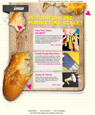
Almost everything in this email works: the subject line, the content blocks and the calls to action. The best part is the overall design, built around a cutting board and a loaf of bread. It gets the tone right. The message invites readers who are unhappy with their online marketing, or with how their brand looks on the web, to start working with the agency. eROI, a Portland, Oregon agency known for email and digital marketing, later changed its name to Thesis.
The campaign’s results were never shared, so nobody outside the agency knows what counted as success or how many conversions it brought in. If you send something similar today, judge it on clicks, replies and booked calls, not opens. Since Apple Mail Privacy Protection arrived with iOS 15 in September 2021, Apple Mail preloads tracking pixels for users who turn the feature on. That pushes open rates up whether or not anyone read the email.
Jupiterimages: special deal promotion

Few emails have ever been designed quite like this one. It has no supporting HTML text at all. The whole message is three images, each in its own table row. Still, the idea behind the design is a winner. The angled layout pulls the eye down the page, so readers scan the whole email and spend time below the fold looking closely at the smaller images.
One fault: the “EMAIL US AT” call to action is not linked to the email addresses. A simple mailto: link would have fixed that. Apart from that, it is strong work. Jupiterimages was a stock image business that Getty Images bought from Jupitermedia for $96 million, in a deal completed in February 2009.
The image-only build is the part that has aged worst. Here is why it would struggle today:
- Image blocking. Gmail has loaded images automatically through its image proxy since late 2013. Classic Outlook for Windows still blocks image downloads by default, so those readers would see an empty frame.
- Accessibility. Screen readers read the live text in an email, and for images they rely on alt text as a text alternative. With no live text, people who use them get almost none of the message.
- Filtering. Spam filters treat all-image mail with little or no text as a warning sign, and it gives the filter nothing to read.
- Mobile and dark mode. Text baked into images doesn’t reflow on small screens and doesn’t adapt when a reader switches to dark mode.
You can keep the angled, eye-catching idea. Build it with images for the visuals and live HTML text for the headline, offer and contact details.
Blue Sky Factory: sales and marketing email

Emails built like a newspaper or traditional printed newsletter were rare even then, and that is why this one made an impression. Several things helped. It is simple. The call to action sits small in the bottom right-hand corner. It balances images and text well. And it makes the case that email marketing still works and still returns more than other marketing channels. Either way, it is a pleasure to open. Blue Sky Factory was a Baltimore email marketing firm founded in 2001. WhatCounts bought it in July 2011.
The argument in the email has held up. Litmus has long published a return of about $36 for every $1 spent on email, and that figure is still one of the most quoted in the industry. The layout is harder to copy now. Several narrow columns look good on a desktop screen but get cramped on a phone. Most newspaper-style newsletters today use a single column that stacks cleanly. A call to action tucked in a corner is also easy to miss on mobile. Make it a full-width button that is easy to tap.
What these designs would need to work today
The ideas behind all three emails still hold up. What would need changing is how they were built, because today’s inboxes are mostly mobile and have stricter rules. The table sums up what to keep and what to fix.
| What still works | What would break today | Modern fix | |
|---|---|---|---|
| eROI | Strong concept, clear tone, several calls to action | Success judged by opens | Track clicks and conversions; treat opens as a rough signal |
| Jupiterimages | Bold layout that pulls readers below the fold | Image-only build, unlinked email addresses | Live HTML text, alt text on every image, mailto: links |
| Blue Sky Factory | Familiar newsletter format, good text-to-image balance | Multi-column layout, small corner call to action | Single column, full-width button, test in dark mode |
Sender rules any showcase-worthy email now has to meet
A great design won’t help if the email never reaches the inbox. Gmail and Yahoo began enforcing new requirements for bulk senders in February 2024. Google counts anyone sending about 5,000 or more messages a day to Gmail accounts as a bulk sender. Those senders need:
- SPF and DKIM authentication, plus a DMARC record aligned with the From domain
- One-click unsubscribe for marketing mail, using the
List-UnsubscribeandList-Unsubscribe-Postheaders, with requests honored within two days - A spam complaint rate in Google Postmaster Tools kept below 0.3%, and ideally under 0.1%
The minimum DMARC record looks like this:
_dmarc.example.com. TXT "v=DMARC1; p=none; rua=mailto:[email protected]"
The one-click unsubscribe headers look like this:
List-Unsubscribe: <https://example.com/unsubscribe?id=abc123>, <mailto:[email protected]>
List-Unsubscribe-Post: List-Unsubscribe=One-Click
Microsoft brought in similar requirements for high-volume senders to Outlook.com, Hotmail.com and Live.com addresses on May 5, 2025. Mail that fails them can be rejected. In the US, the CAN-SPAM Act still requires a valid physical postal address and a clear way to opt out in every commercial email, so the footer is part of the design too.
The best place to start is the email you already send. Open it on a phone with images turned off and dark mode on. If the offer, the call to action and the unsubscribe link still come through clearly, the design is doing its job.
FAQ
Are image-only emails still a bad idea?
Yes, for nearly every campaign. Classic Outlook for Windows blocks images by default, screen readers have only alt text to go on when there is no live text, and spam filters distrust messages with little or no live text. Put the key message and the call to action in HTML text, and use images to support them.
Should email newsletters use a single column or multiple columns?
Use a single column for most newsletters, because most opens now happen on phones and one column stacks without breaking. You can still use two columns for small items such as product grids, as long as they stack on narrow screens. A newspaper look is fine. Just build it in a way that reflows on mobile.
Why can’t open rates be trusted to judge a design?
Apple Mail Privacy Protection preloads tracking pixels for users who turn it on, so many “opens” are machine-generated. Other privacy tools and image proxies blur the numbers further. Clicks, conversions and revenue per email are better ways to tell whether a design works.
How should emails handle dark mode?
Test in Apple Mail, the Gmail apps and Outlook, because each one changes colors differently. Give logos and icons a transparent background with a light outline or padding, so they don’t disappear on dark backgrounds. Avoid putting important text inside images, since it won’t adapt to the reader’s color settings.
What makes Gmail clip an email?
Gmail cuts off messages whose HTML is larger than about 102KB and shows a “[Message clipped]” link instead. That can hide your footer and unsubscribe link. The image files don’t count toward the limit, only the code, so tidy up bloated HTML and inline styles to stay under it.
Do design choices affect deliverability?
Yes, indirectly. Messy code, image-heavy layouts and hidden or hard-to-find unsubscribe links can lead to more spam complaints and closer filtering. Gmail expects bulk senders to keep complaints under 0.3%. A clear layout with an easy unsubscribe helps you stay well below that.
Sources
- Google: Email sender guidelines (Gmail Help)
- Google: Email sender guidelines FAQ
- Yahoo Sender Hub: Sender best practices and requirements
- Microsoft Tech Community: Outlook’s new requirements for high-volume senders (April 2, 2025)
- Federal Trade Commission: CAN-SPAM Act, A Compliance Guide for Business
- Apple Support: Use Mail Privacy Protection on iPhone
- ActiveCampaign Help Center: Why is Gmail clipping my email