
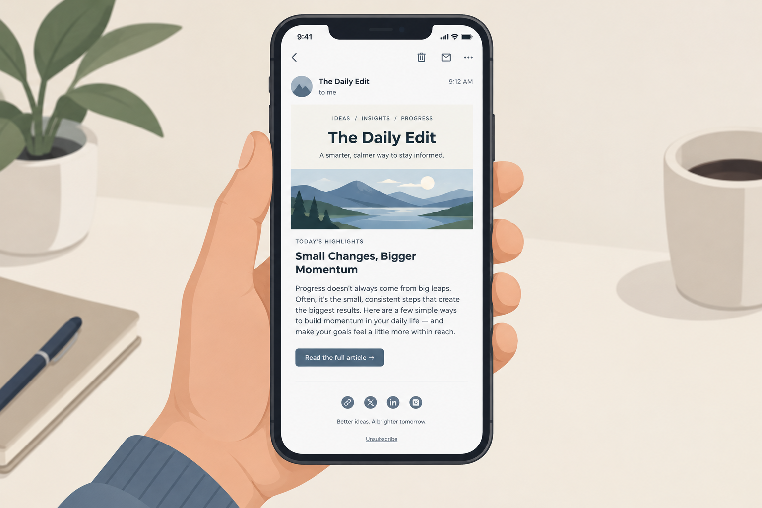
Yes, your emails should follow one consistent template, and in November 2026 the case is stronger than when this post first ran. A fixed layout teaches subscribers where to find what they want, makes click data comparable from one issue to the next, and cuts production time. The template now carries more weight too. Most people read email on a phone, often in dark mode. Apple Mail Privacy Protection has made open rates unreliable since 2021. And since 2024, Gmail and Yahoo have required bulk senders to include one-click unsubscribe and keep spam complaints under 0.3%, so the footer has become a compliance tool as well as a design element.
Why emails should follow a template
An article on BtoB Online asked whether emails should follow a specific template. The answer, quite simply, is yes.
Over time your subscribers will know exactly what to expect. Familiar navigation lets readers get to the information they care about most, quickly. That doesn’t mean you can never update the look and feel or change your logo. The structure of the template should stay the same, though: header, lead story, secondary content, call to action and footer, in the same order every time.
Today, familiarity has to hold up on a small screen. A single-column layout around 600 pixels wide, which stacks cleanly on phones, does this better than the multi-column newsletter grids that were common when this advice was first written. Those grids were built for desktop clients such as Outlook 2007, whose Word-based rendering engine shaped email design for years. That era is history now. The current tests are an iPhone, Gmail on Android and dark mode.
Use campaign metrics to see how readers navigate
You can learn how readers move through your emails without a full usability study. Review the metrics after each campaign. Which links get clicks, and which don’t? Lay the data from several issues on top of each other and you can see how ease of navigation and relevance of content relate to each other.
This works only because the template stays the same. If the lead story always sits in the same slot, a drop in clicks on that slot points to the content, not the layout. Most email service providers offer a click map or per-link report, so you can compare positions across issues without extra tools.
One measurement has changed since this advice was written: use clicks, not opens. Apple Mail Privacy Protection loads remote content, including the tracking pixel, through Apple’s proxy servers, often soon after delivery, whether or not anyone reads the message. Open rates are inflated for Apple Mail users, and click-to-open rates look lower than they really are. Click-through rate, clicks per position and conversions are the numbers that show how people actually use your template.
A standard template saves time
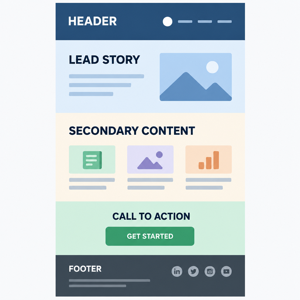
A standard template has other benefits too. Deciding which elements you need before you send helps copywriters write tight copy for the space available, and it greatly reduces design time for your production team.
Modern email builders take this further with saved, reusable content blocks. Your team builds the header, product grid and footer once, checks them in the major clients, and reuses them. This lowers the risk of a broken layout in a rushed send.
What every template needs today
A 2026 template has to meet reader expectations and mailbox provider rules at the same time. These are the fixed elements worth building in once, so they never get skipped:
| Template element | Why it matters | The rule or limit behind it |
|---|---|---|
| Visible unsubscribe link in the footer | Required for commercial email in the US | CAN-SPAM: honor opt-outs within 10 business days |
| Valid physical postal address | Required for commercial email in the US | CAN-SPAM, per the FTC’s compliance guide |
| One-click unsubscribe header (List-Unsubscribe) | Lets Gmail and Yahoo show their own unsubscribe button | Required for bulk marketing mail since 2024; Google asks you to honor requests within 2 days |
| Lean HTML | Gmail cuts off long messages and adds a “View entire message” link, which can hide your footer | Clipping starts at about 102KB of code, a figure ESPs such as Klaviyo document (Google doesn’t publish it) |
| Dark mode-safe logo and colors | Stops logos from disappearing on dark backgrounds | Use transparent PNGs with an outline, or a separate dark version |
| Alt text on images | Keeps the email readable when images are blocked | Matters for accessibility and for clients that block images by default |
| Single-column, mobile-first layout | Most opens happen on phones | Width of about 600px that stacks on small screens |
The one-click unsubscribe line is the one that changed most. Gmail applies its stricter rules to senders who send close to 5,000 or more messages a day to personal Gmail accounts. Google requires those senders to authenticate with SPF, DKIM and DMARC, support one-click unsubscribe and keep their reported spam rate below 0.3%. Yahoo enforces similar rules but doesn’t publish a volume threshold. Microsoft added its own requirements, including SPF, DKIM and DMARC, for senders of more than 5,000 messages a day to Outlook.com addresses on May 5, 2025. An easy unsubscribe in your template is the cheapest way to keep complaints down: a reader who can leave in one tap is less likely to hit “Report spam.”
Creating a better user experience will help you increase readership and retention.
Source: the original BtoB article on standard email templates.
FAQ
Should every email I send use the same template?
Use one template per type of email: one for newsletters, one for promotions, one for transactional messages such as receipts. Within each type, keep the structure fixed so readers and your click data stay consistent. Mixing layouts within one stream makes issues hard to compare.
Can I redesign my email template without confusing subscribers?
Yes, if the order of sections stays the same. A new logo, color palette or font is fine. Moving the main call to action or the navigation is what confuses readers. For a bigger redesign, change one element per send and watch clicks per position before you move on to the next.
Are open rates still useful for judging a template?
Not on their own. Apple Mail Privacy Protection loads the tracking pixel whether or not anyone reads the email, so opens are inflated wherever Apple Mail is common. Judge layout changes by click-through rate, clicks per link position and conversions.
Does my template need a one-click unsubscribe?
If you send bulk marketing mail to Gmail or Yahoo users, yes. Both began enforcing their sender requirements in February 2024, and one-click unsubscribe is typically handled through the List-Unsubscribe headers your ESP adds, alongside authentication and low spam rates. CAN-SPAM separately requires a clear opt-out and a physical postal address in every commercial email, B2B mail included. Keep a visible footer link as well as the header.
How big can an email template be before Gmail clips it?
Gmail clips messages whose HTML is larger than about 102KB and hides the rest behind a “View entire message” link. Linked images hosted on a server don’t add to the HTML size, but images embedded in the message count toward Gmail’s overall message-size limit. Bloated builder code and long product grids are the usual causes, so check the size of a test send before a big campaign.
What width should an email template be?
Around 600 pixels in a single column is still the standard, because it fits desktop reading panes and scales down well on phones. Use fluid or stacking columns so content doesn’t shrink into tiny text on mobile, and test in dark mode before you lock the design.
Sources
- Google, Email sender guidelines (Gmail Help)
- Google, Postmaster Tools help
- Yahoo, Sender Hub best practices for senders
- Microsoft, Outlook requirements for high-volume senders (Microsoft Tech Community, April 2025)
- Federal Trade Commission, CAN-SPAM Act: A Compliance Guide for Business
- Klaviyo Help Center, Why is my email being clipped
- Apple, Mail Privacy Protection overview